Project Overview
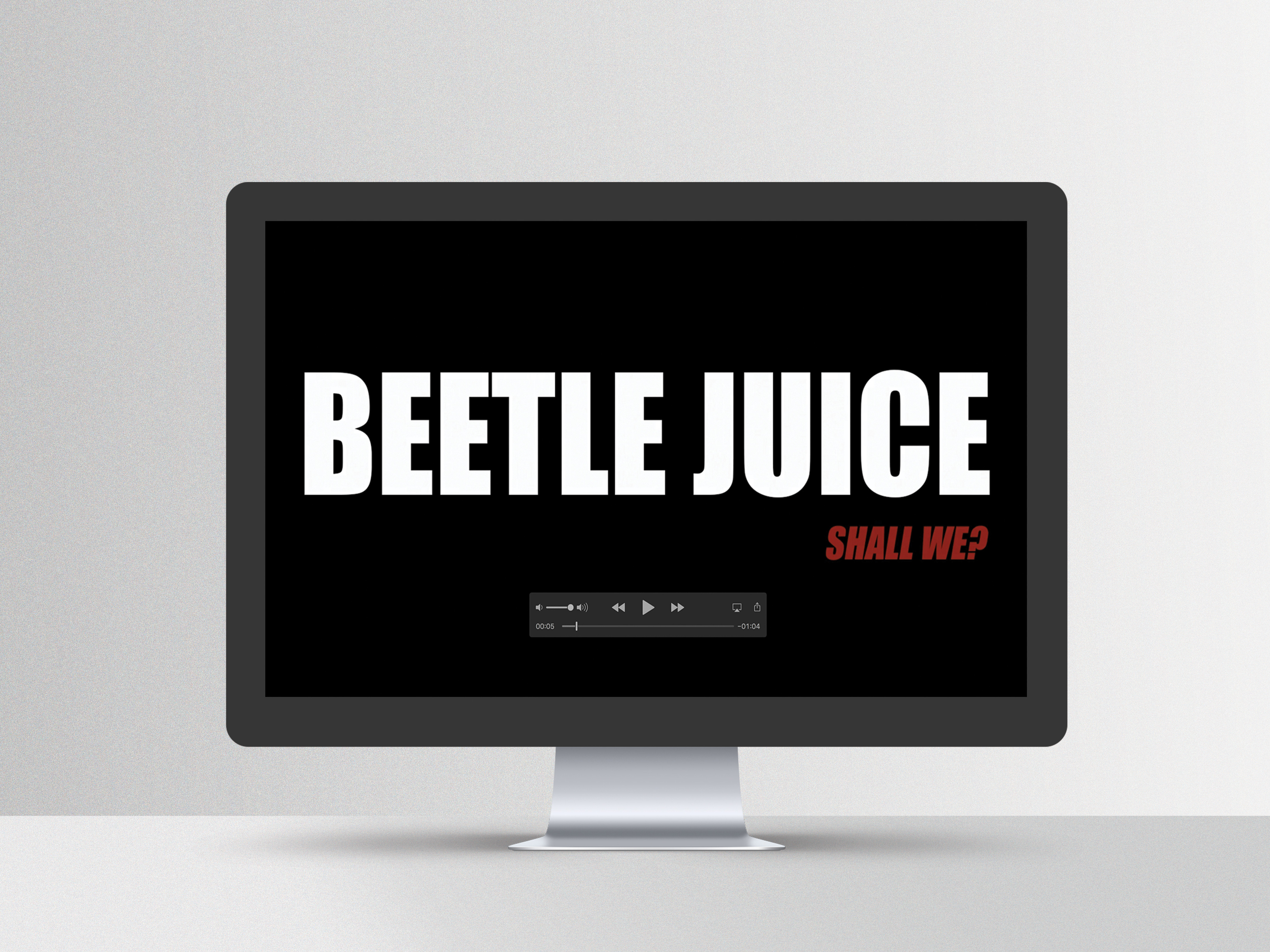
This project challenged me to reimagine a well-known brand and make it my own through the lens of editorial design. I created a fashion magazine that reflects a clean, modern aesthetic while introducing fashion icons, models, and photography in a visually engaging way. The goal was to balance bold imagery with structured layouts that would feel both editorial and elevated.
This project challenged me to reimagine a well-known brand and make it my own through the lens of editorial design. I created a fashion magazine that reflects a clean, modern aesthetic while introducing fashion icons, models, and photography in a visually engaging way. The goal was to balance bold imagery with structured layouts that would feel both editorial and elevated.
Creative Process
I began by establishing a two-column grid for the main content pages, allowing photography to take center stage while keeping the layout clean and digestible. For the featured article, I shifted to a three-column grid to add contrast and structure to the reading experience. My favorite part of the process was designing the cover, selecting the right image, refining type placement, and ensuring everything worked in harmony. To show the evolution, I documented several iterations of the cover, highlighting my decision-making along the way.
I began by establishing a two-column grid for the main content pages, allowing photography to take center stage while keeping the layout clean and digestible. For the featured article, I shifted to a three-column grid to add contrast and structure to the reading experience. My favorite part of the process was designing the cover, selecting the right image, refining type placement, and ensuring everything worked in harmony. To show the evolution, I documented several iterations of the cover, highlighting my decision-making along the way.
Concept
The concept focused on blending simplicity with sophistication. I wanted to let the photography speak while using clean lines, structured grids, and subtle typography to support the visual narrative. By reinterpreting an existing brand through a fashion-forward lens, the final piece captures a timeless yet contemporary editorial style that feels fresh and curated.
The concept focused on blending simplicity with sophistication. I wanted to let the photography speak while using clean lines, structured grids, and subtle typography to support the visual narrative. By reinterpreting an existing brand through a fashion-forward lens, the final piece captures a timeless yet contemporary editorial style that feels fresh and curated.
Programs
Indesign and Photoshop.
Indesign and Photoshop.
