Project Overview
During my senior year at George Mason University, I revisited a project originally created during my sophomore year, a z-fold brochure for a fictional fashion brand. I saw this as an opportunity to elevate the concept by rebranding the company with a more modern identity and transforming the format into a set of responsive web and mobile landing pages. The goal was to reflect a more industry ready skill set while pushing the brand’s visual presence into a contemporary, digital-first direction.
During my senior year at George Mason University, I revisited a project originally created during my sophomore year, a z-fold brochure for a fictional fashion brand. I saw this as an opportunity to elevate the concept by rebranding the company with a more modern identity and transforming the format into a set of responsive web and mobile landing pages. The goal was to reflect a more industry ready skill set while pushing the brand’s visual presence into a contemporary, digital-first direction.
Creative Process
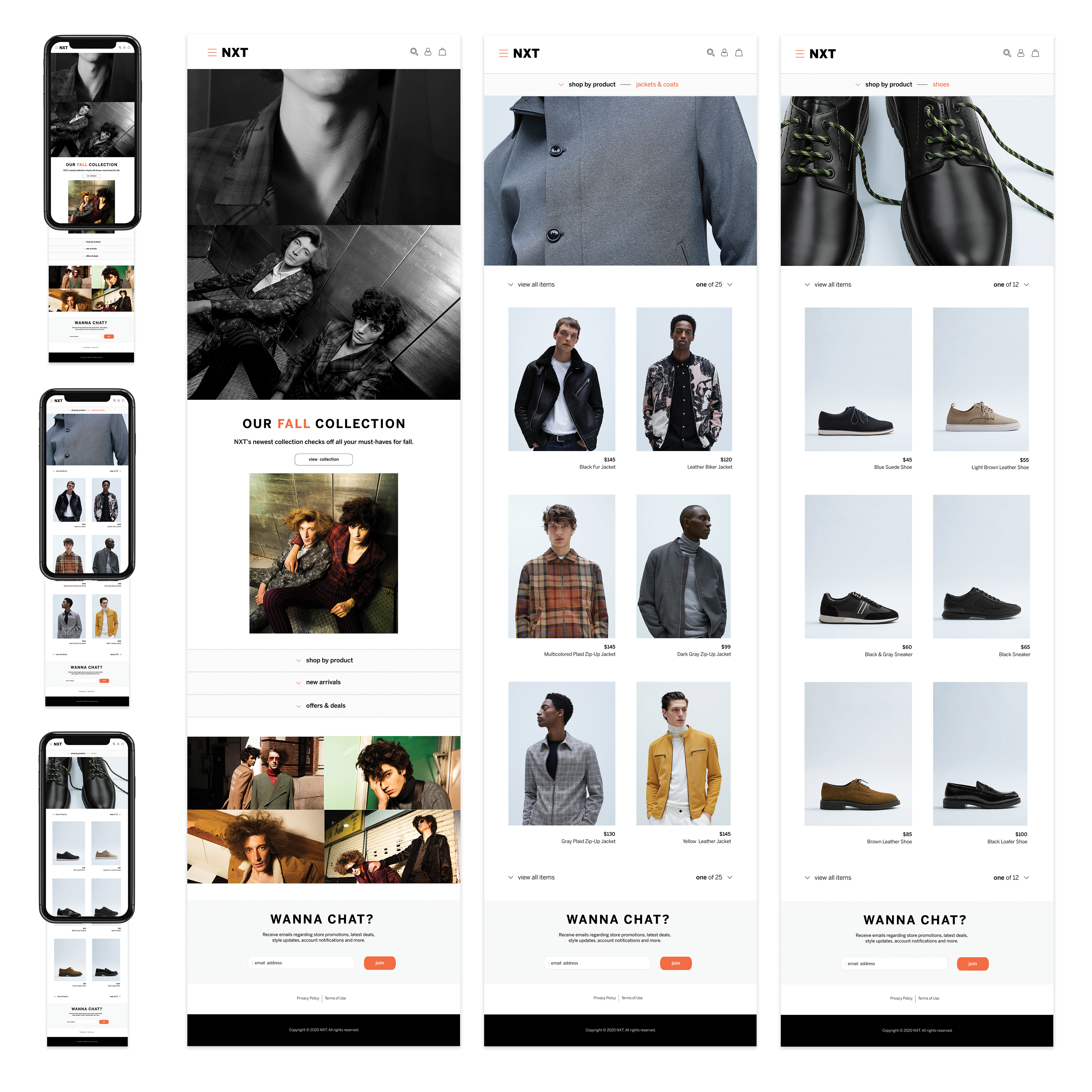
The redesign began with a complete evaluation of the original brand’s tone, layout, and visual limitations. I reimagined the company as "NXT," aligning the name with a forward-looking tagline: Next In Fashion. From there, I built a fresh visual identity, including typography, color palette, and interface design elements, all tailored for digital platforms. Instead of sticking with the previous print format, I focused on UX/UI principles to design clean, engaging landing pages optimized for both web and mobile experiences.
The redesign began with a complete evaluation of the original brand’s tone, layout, and visual limitations. I reimagined the company as "NXT," aligning the name with a forward-looking tagline: Next In Fashion. From there, I built a fresh visual identity, including typography, color palette, and interface design elements, all tailored for digital platforms. Instead of sticking with the previous print format, I focused on UX/UI principles to design clean, engaging landing pages optimized for both web and mobile experiences.
Concept
The core idea behind the rebrand was innovation, positioning the fashion brand as trend-forward, sleek, and digitally driven. The name "NXT" not only modernizes the brand but also reflects its aspirational voice and future focused vision. Visually, the design features minimalistic typography, a darker color palette, and intuitive layouts to create a high-end, editorial feel that resonates with fashion audiences. The transition from print to digital represents a shift in both platform and mindset, mirroring the evolution of how users engage with fashion content today.
The core idea behind the rebrand was innovation, positioning the fashion brand as trend-forward, sleek, and digitally driven. The name "NXT" not only modernizes the brand but also reflects its aspirational voice and future focused vision. Visually, the design features minimalistic typography, a darker color palette, and intuitive layouts to create a high-end, editorial feel that resonates with fashion audiences. The transition from print to digital represents a shift in both platform and mindset, mirroring the evolution of how users engage with fashion content today.
Programs
Adobe XD, Illustrator, and Indesign.
Adobe XD, Illustrator, and Indesign.
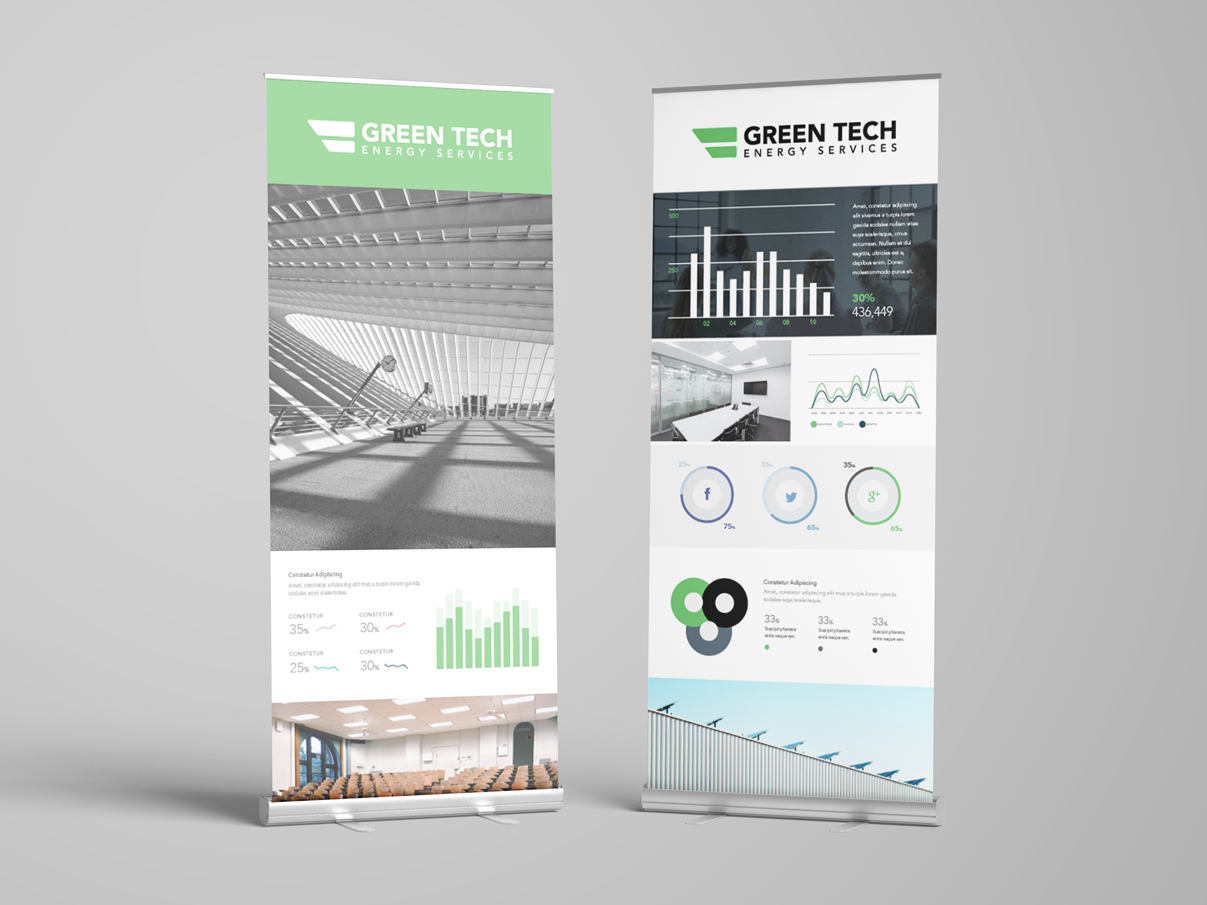
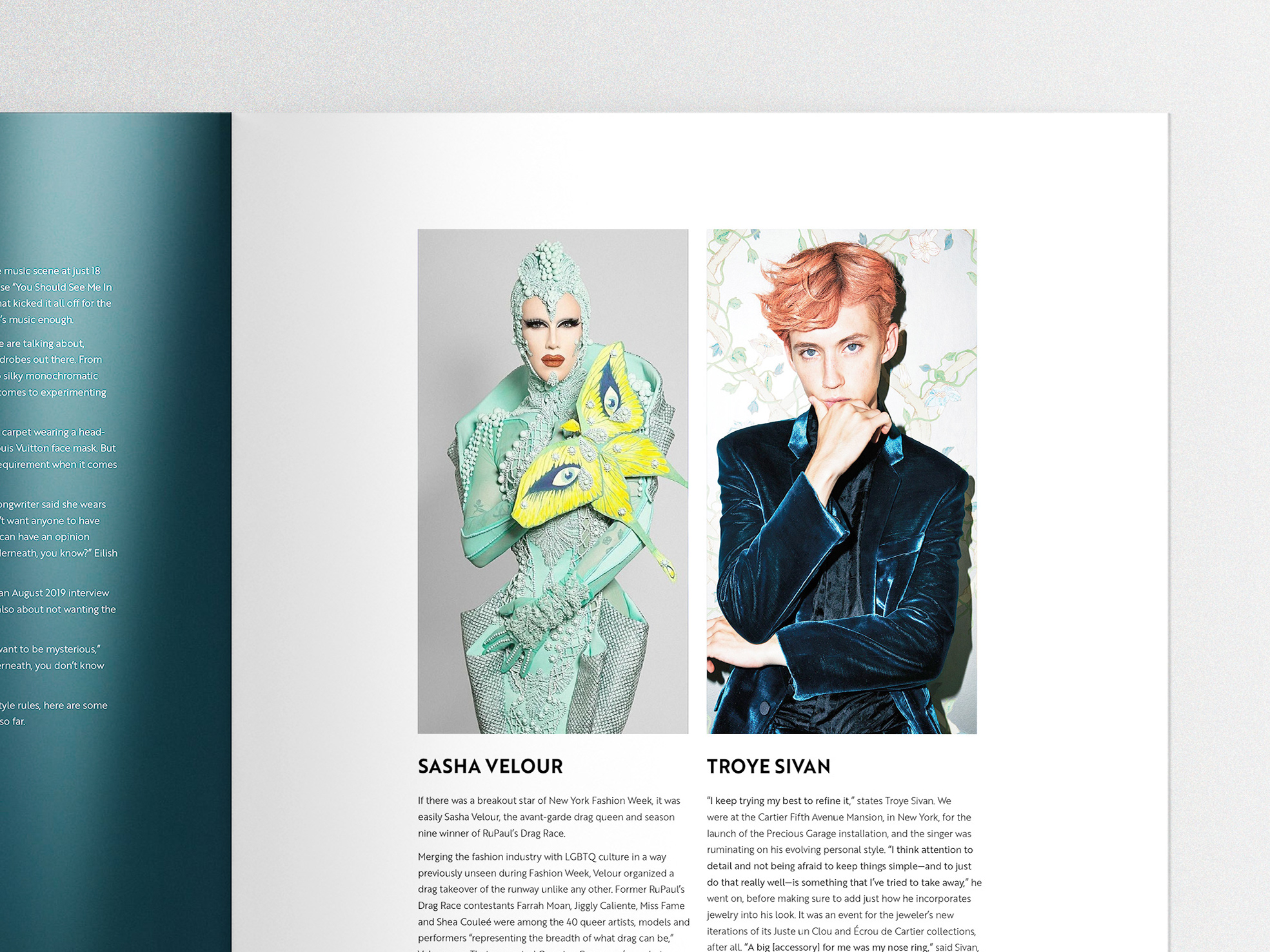
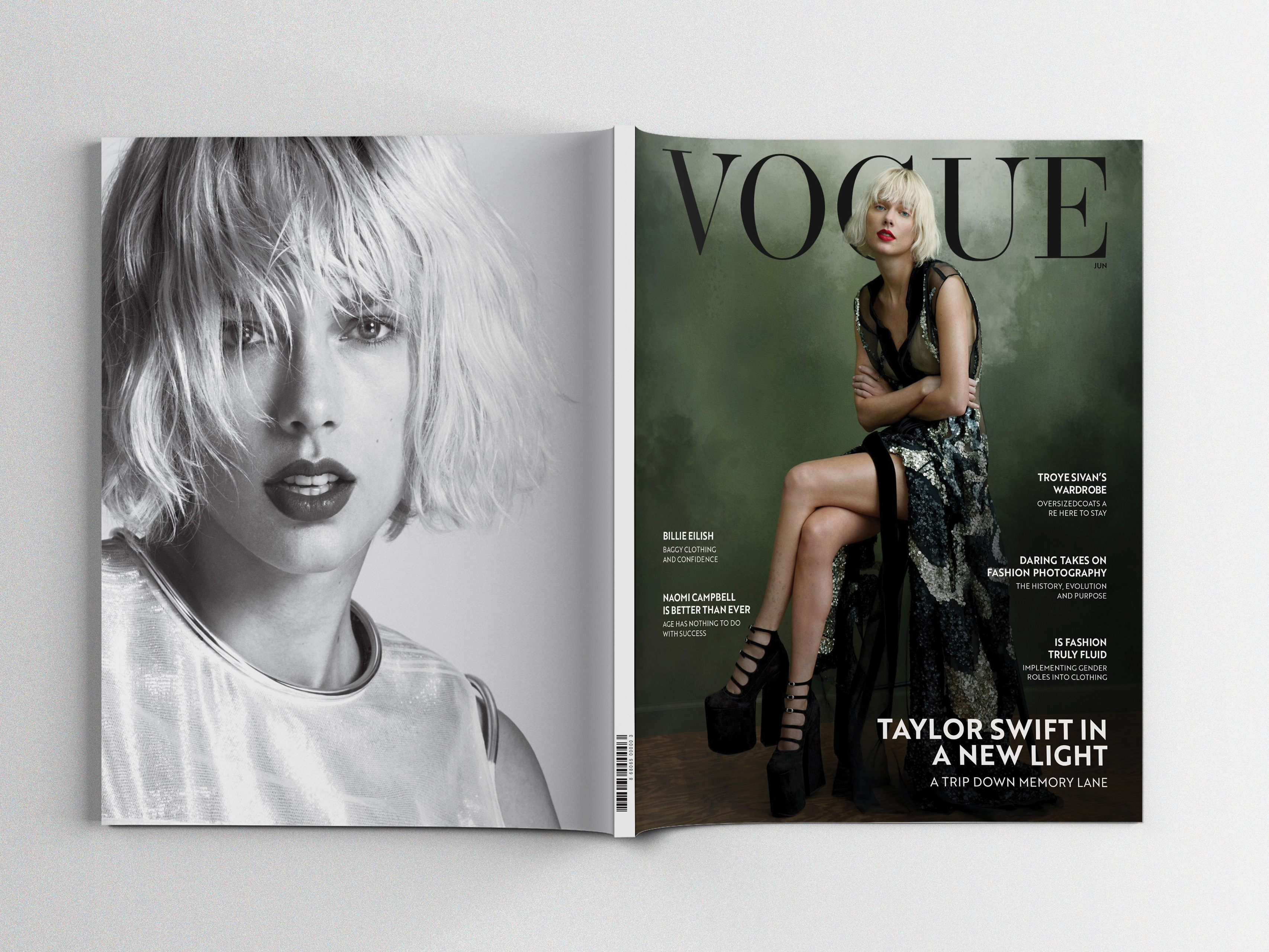
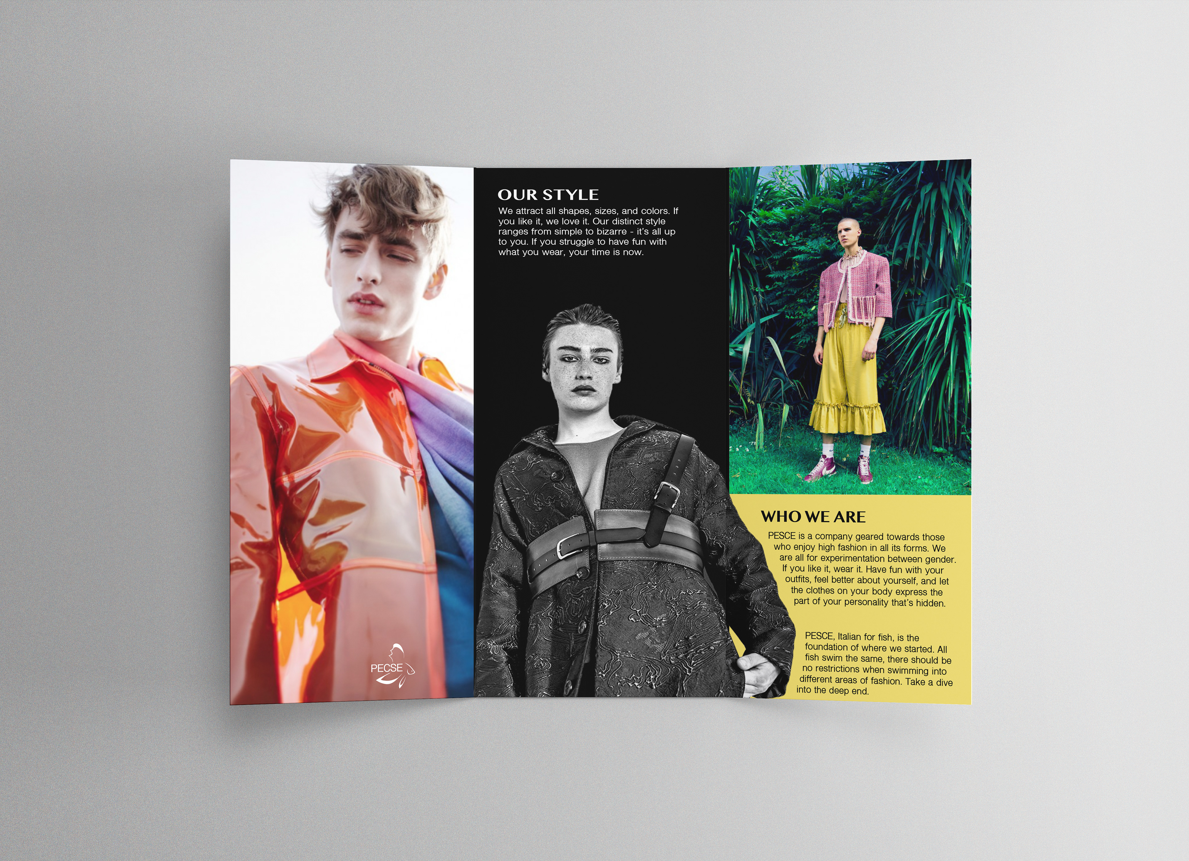
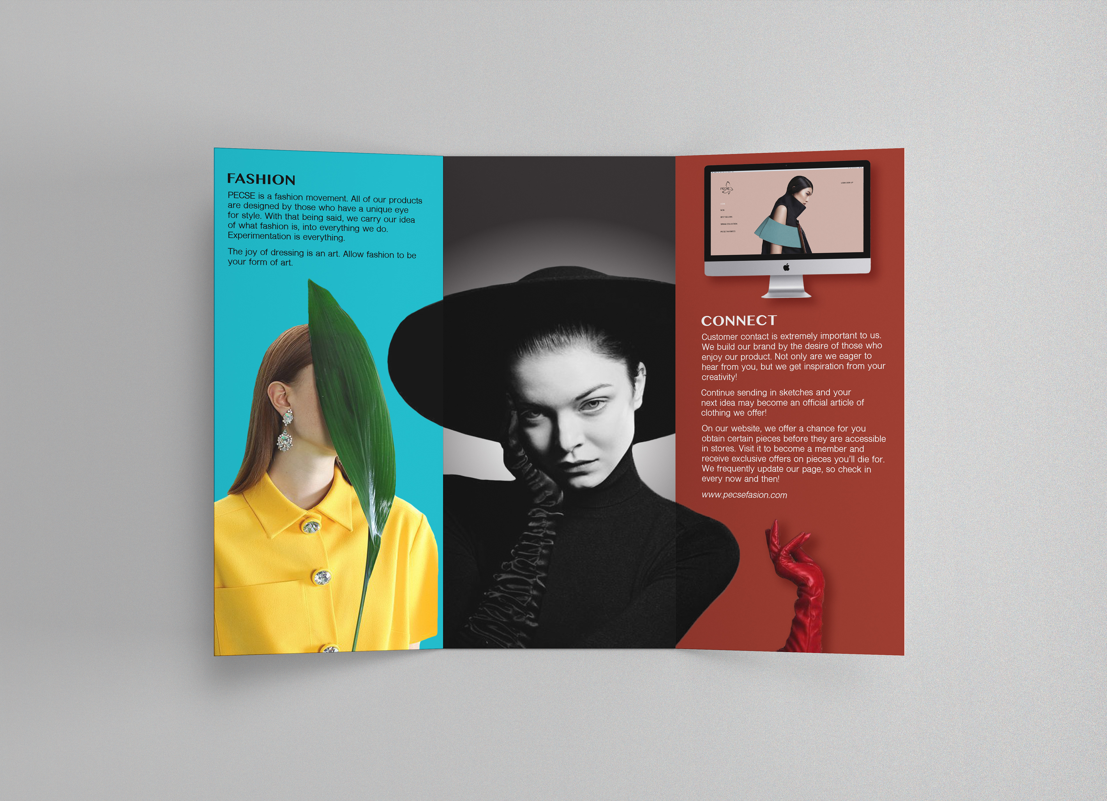
The z-fold shown below is the original project I used as the foundation for the redesign.
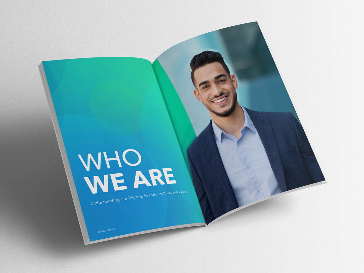
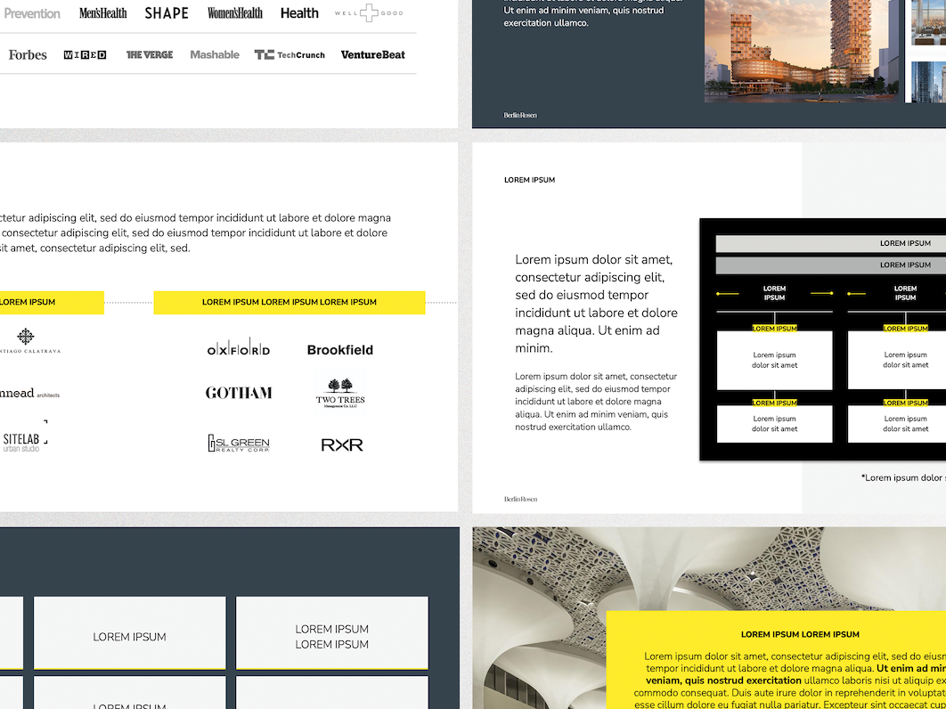
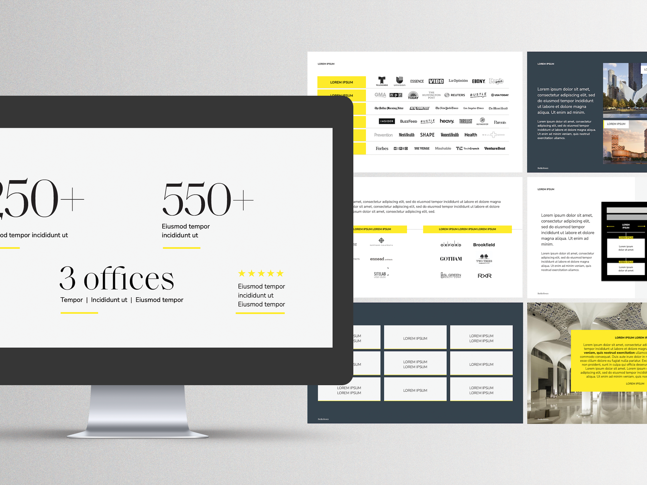
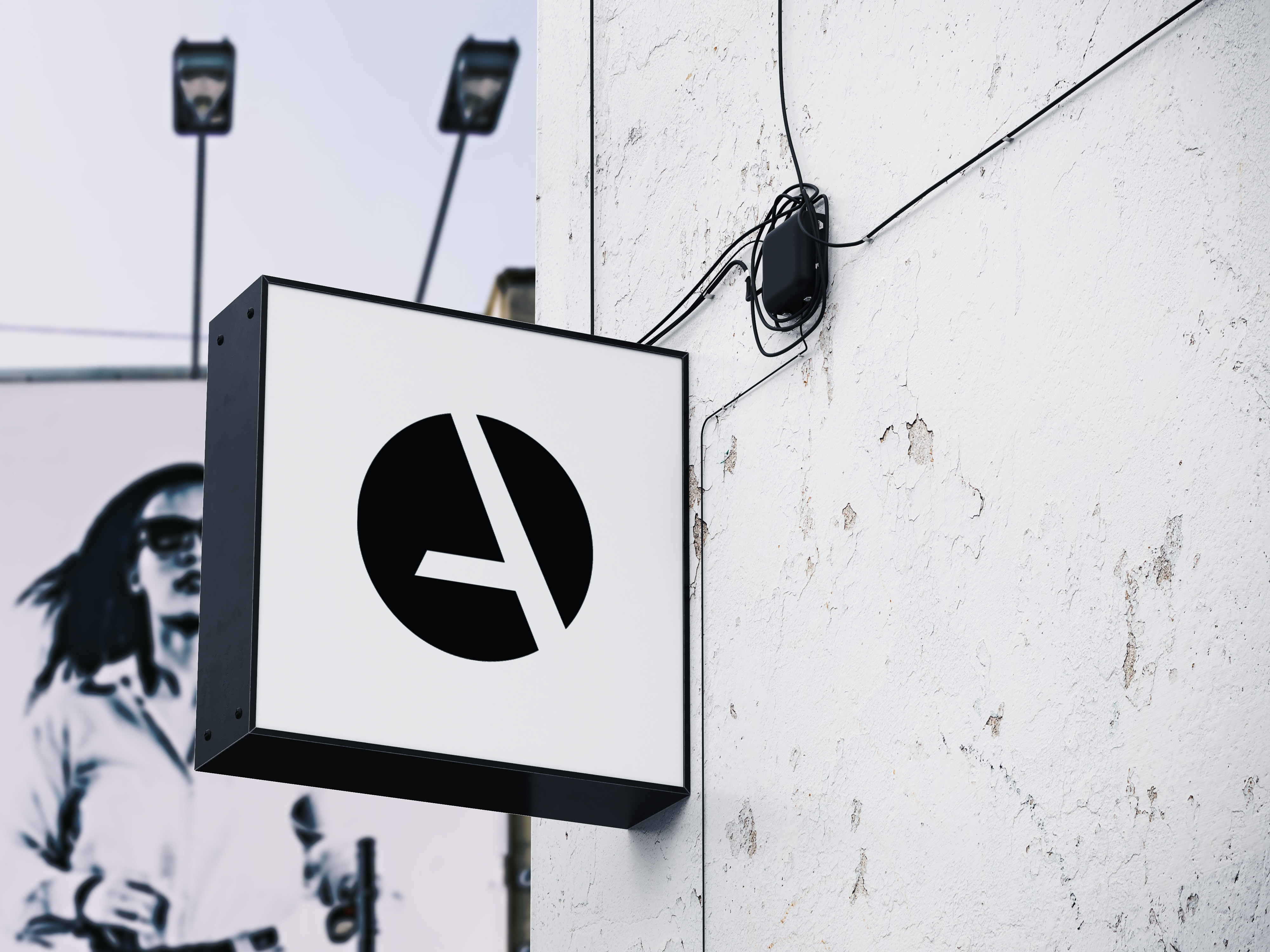
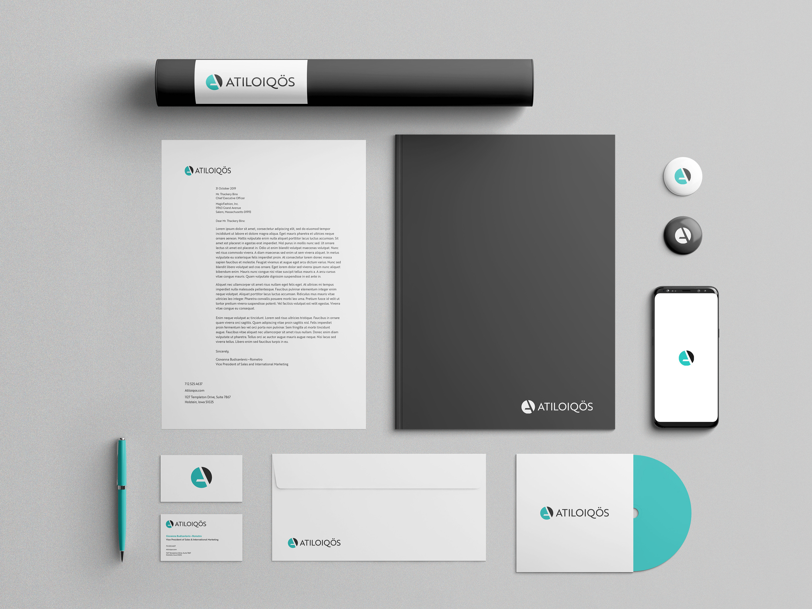
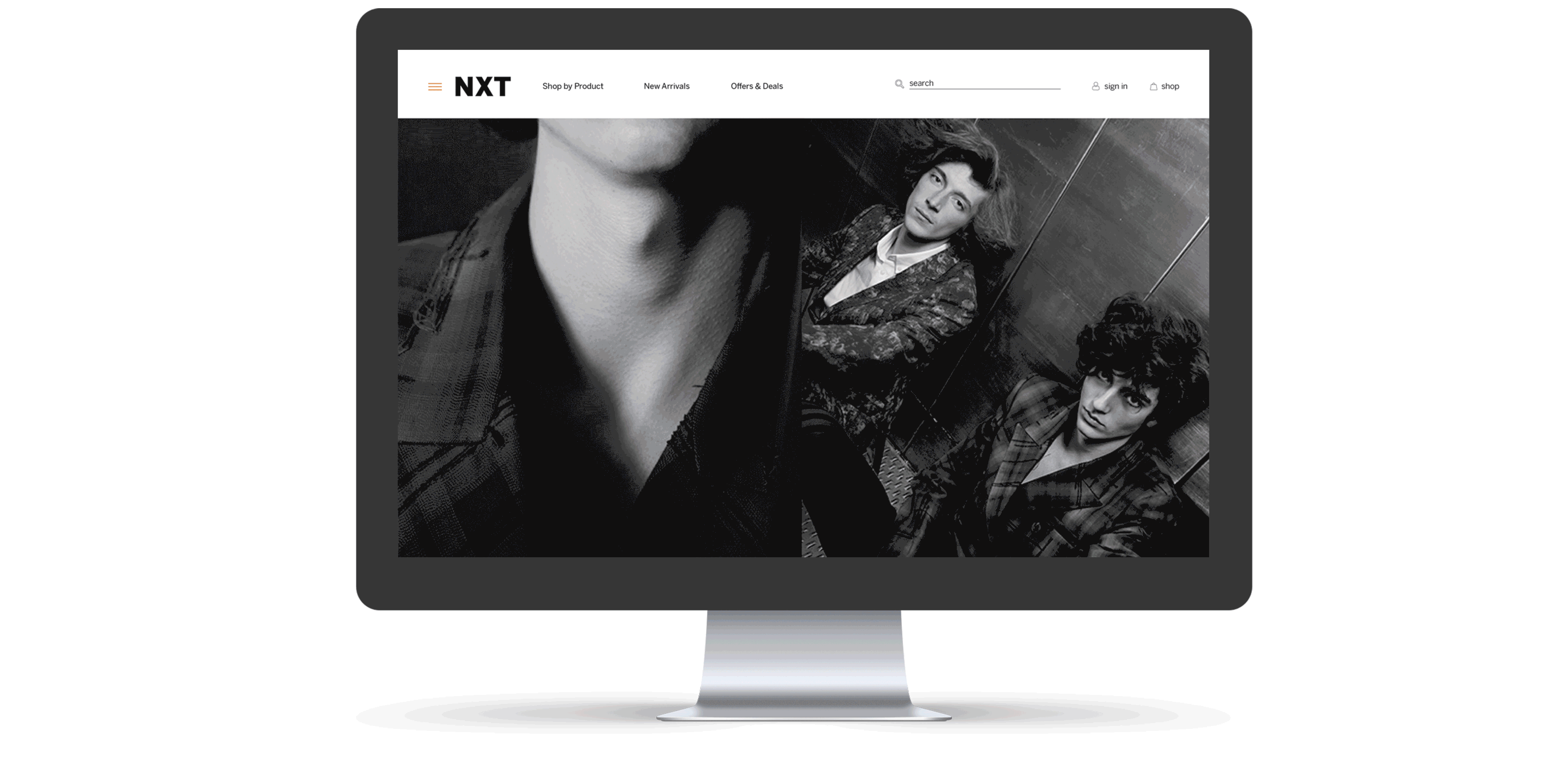
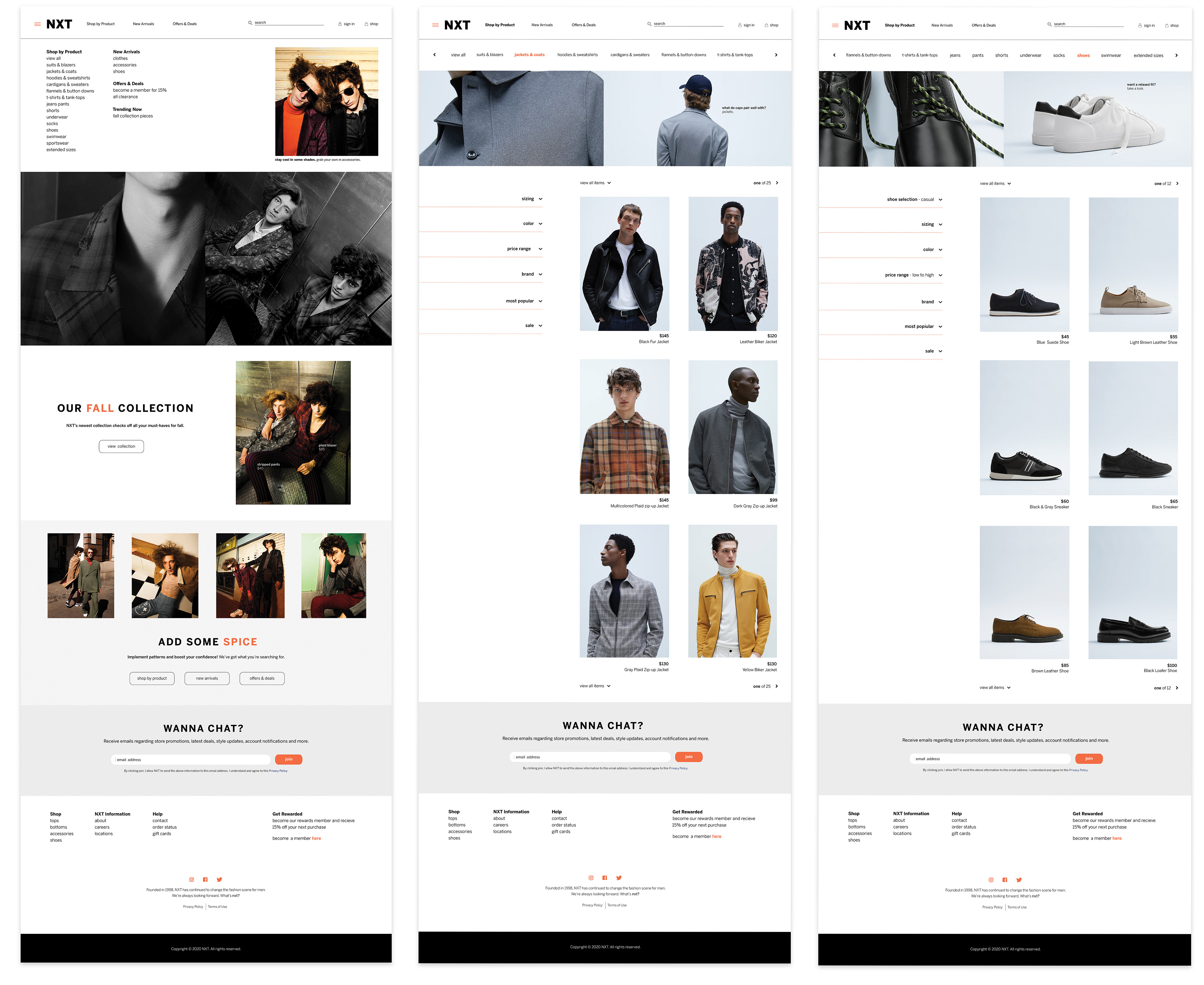
The following includes all visual assets created for the new branding and redesigned concept.
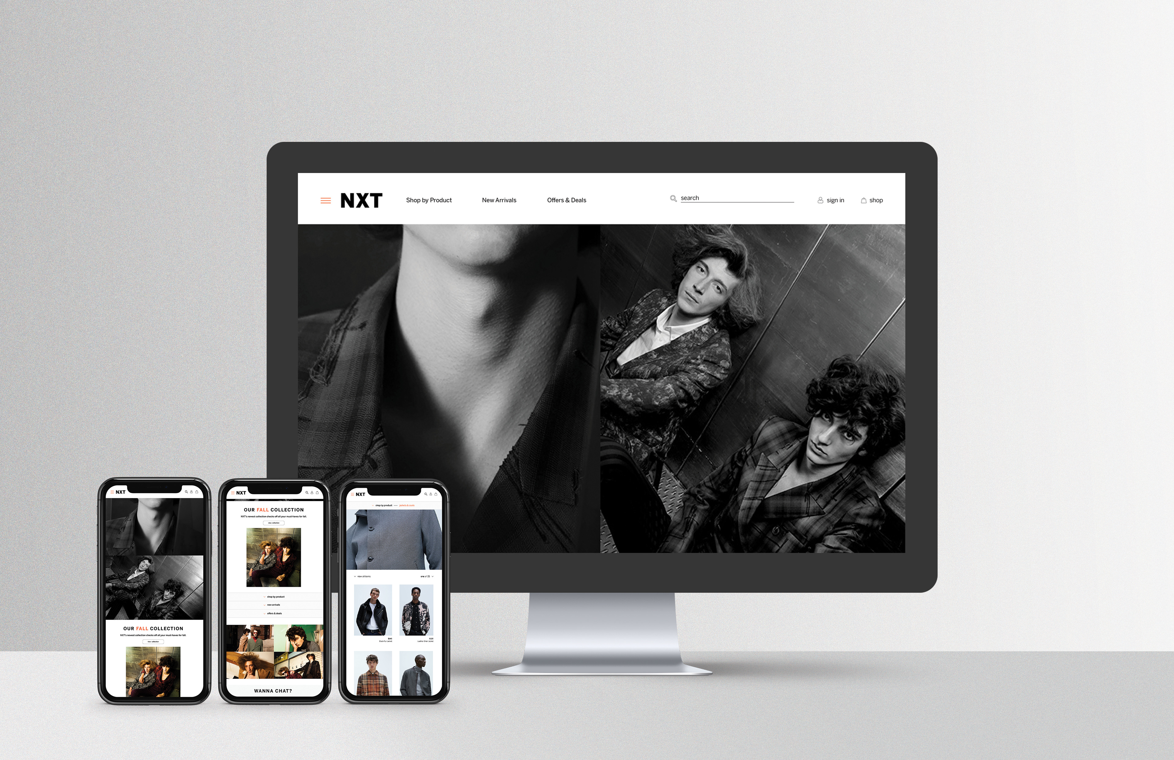
You've seen the web version, now here’s how the site would appear on mobile.